Composition
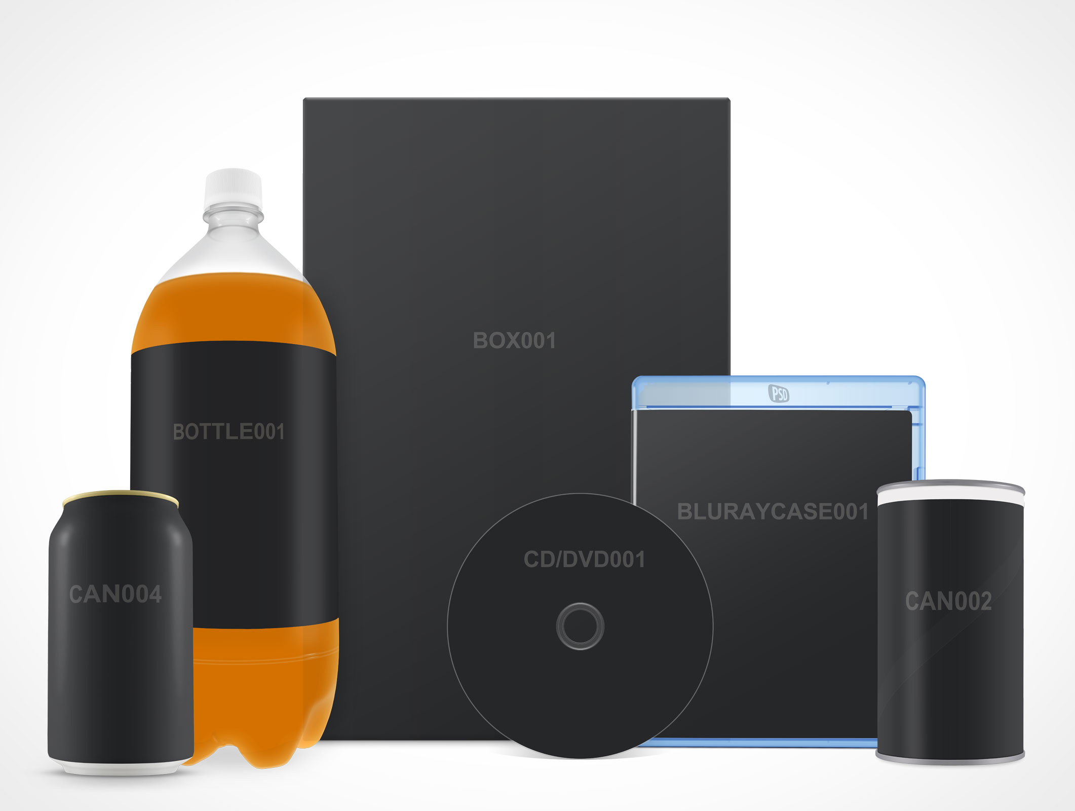
Composition plays a big role in the day to day efforts of many designers, students and marketing professionals. It’s used to carry a message, convey a feeling or create an atmosphere with a target audience. And however static the Actions may appear on our site, these can be composited to create layouts similar to the featured image for this article.
As our catalog of mutiple-angled products and objects grows so does the likelihood that other products with the same angles will appear on the site. As this number grows then so will the possible combinations at your disposal.
In the short term however, there are already multiple Actions which can be combined to create unique layouts.
Tutorial
The following tutorial makes use of 3 Actions: BOX001, CAN003 and MUG001. We suggest viewing this tutorial as a companion piece (our Actions 101 tutorial).
Step 1: Actions Palette
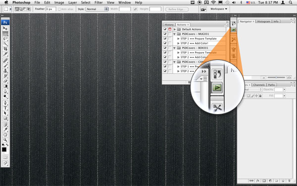
figure 01
Open the Actions palette using the panels icon or through Photoshop’s Window menu.
Step 2: Locate MUG001 Action
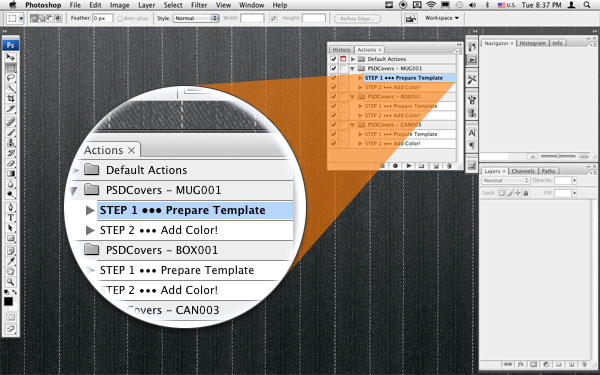
figure 02
Expand the folder for the Action MUG001 and select the first step (prepare template).
Step 3: Prepare MUG001 Template
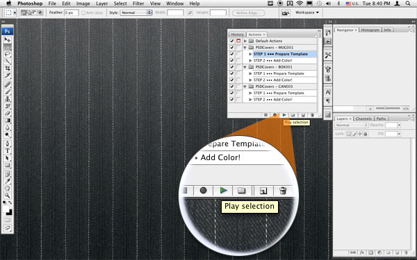
figure 03
Click the play selection button. This will create a template into which you will paste your 2D texture to be applied to the product.
Step 4: 2D Texture Template
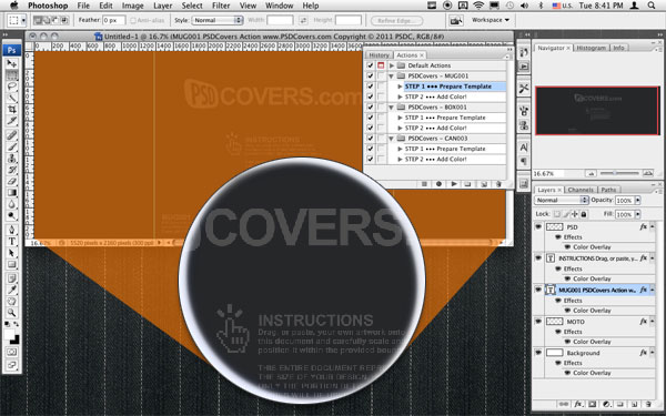
figure 04
A PSDCovers default texture is rendered for every Action with basic instructions on how to place your 2D texture such that it will render properly. These are not identical across all out Actions so it’s important to read it whenever you prepare a template.
Step 5: 2D Texture Preparation
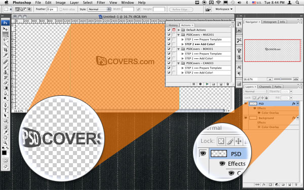
figure 05
Placement in the template and in the layer palette is crucial to the success of a proper rendering. The MUG001 template has specific instructions to place the portion of your 2D texture between the 2 guidelines located near the centre of the template document. The rest of your 2D texture is not rendered because that would technically mean rendering onto the rear of the mug which is not visible. For this demonstration we are simply going to render our logo directly onto all the products.
Step 6: Run Render Process
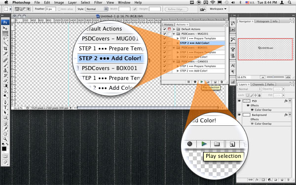
figure 06
Now that the texture is properly placed we can run the rendering process. Select step 2 from the MUG001 Action and hit the Play selection button.
Step 7: Rendered Output
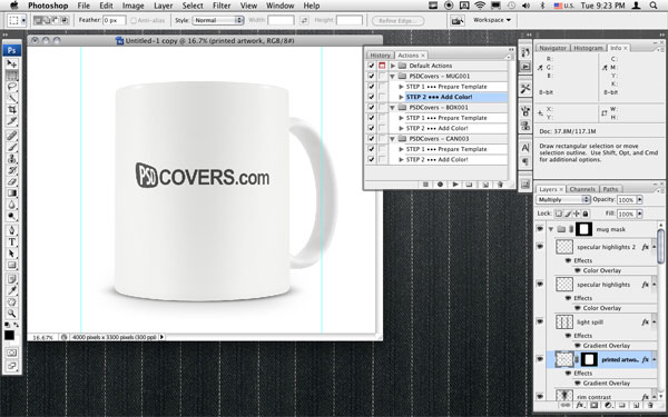
figure 07
And here is the result!
Step 8: Rinse, Lather, Repeat
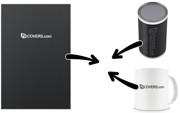
figure 08
Run step 1 and 2 for BOX001 and CAN002 and combine the results onto a 10,000×9000 canvas.
Step 9: Rough Composition
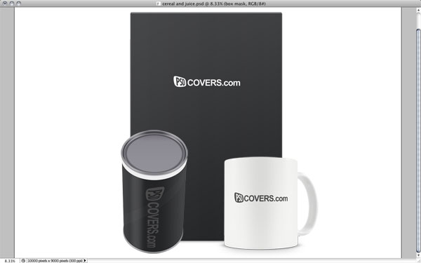
figure 09
Now that all the elements are on a single canvas we can roughly position them as a group, however, doing this can sometimes give the impression that some Actions are simply not meant to be used together. In this case our CAN002 clearly has the wrong camera angle and perspective for this layout.
Luckily, and partially because the can is cylindrical, we can fudge the apparently incompatible can with a simple rotation.
The Final Shot
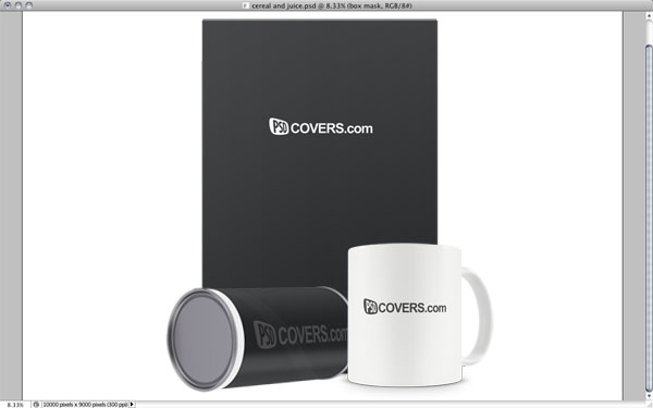
figure 10
Simply turning the can onto its side will visually fix the incorrect can angle and we end up with a composition worthy of a breakfast of champions.

